
You’ve built your monday.com dashboard, loaded it with data, and now you’re staring at a sea of identical colors wondering how to make sense of it all. Sound familiar?
Here’s the good news: customizing your dashboards to look polished and professional takes just a few clicks. Whether you’re tracking a P&L statement, managing projects, or monitoring team performance, making your dashboards visually intuitive helps you spot trends faster and make better decisions.
Let’s walk through exactly how to customize colors and reorder items in your dashboards.
If you want to watch the tutorial, check this video:

Why Dashboard Customization Matters
Before we jump into the how-to, consider this: when every column in your dashboard looks identical, your brain has to work harder to process information. Strategic use of color and logical ordering transforms your dashboard from a data dump into a decision-making tool.
For example, if you’re tracking monthly revenue, making positive months green and negative months red gives you instant visual feedback. No more squinting at numbers to figure out which months performed well.
How to Customize Your Dashboard
The customization options live in a place you might not expect. Here’s how to find them:
Look for the three-dot menu (⋮) on your dashboard widget. This is typically located in the top-right corner of the specific widget you want to customize. Click those three dots and select Settings from the dropdown menu.
Once you’re in the settings panel, you’ll see several options. The one you want is Customize. Click it, and you’ll unlock the ability to change colors and reorder items.
01. Changing Colors in Your Dashboard
Inside the customize menu, you’ll see a list of all the items currently displayed in that widget. Each item has three options next to it: color selection, name editing, and drag-to-reorder functionality.
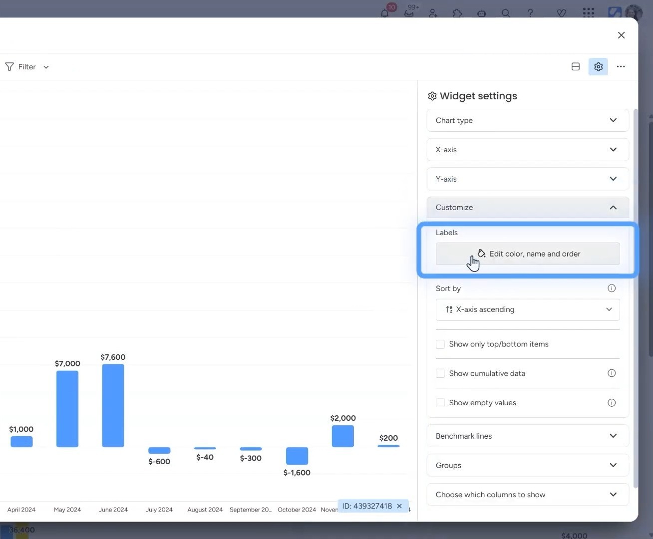
To change a color, simply click on the color square next to any item. A color picker will appear with monday.com’s full palette. Choose the color that makes sense for your use case.
Think about what colors mean in your context:
- Green for positive results, completed items, or on-track metrics
- Red for negative results, overdue items, or problem areas
- Blue for neutral information or standard categories
- Yellow/Orange for warnings or items needing attention
For a financial dashboard tracking monthly performance, you might make profitable months green and loss months red. For a project timeline, you could use different colors for different departments or project phases.
The key is consistency. Once you establish a color system, stick with it across all your dashboards so your team immediately understands what each color represents.
02. Reordering Dashboard Items
Remember the old workaround of adding “A,” “B,” “C” to item names just to control the order? You can forget about that now.
In the same customize menu where you changed colors, you can drag items to reorder them. Simply click and hold on any item in the list, then drag it up or down to your preferred position.
This is particularly useful when you want to:
- Arrange months chronologically (January through December)
- Order projects by priority rather than alphabetically
- Group related items together for easier scanning
- Place your most important metrics at the top
The visual order you set here will immediately reflect in your dashboard widget, making the information flow exactly how you need it.
Practical Application: Financial Dashboards
Let’s say you’re working with a P&L dashboard in monday.com. Initially, all twelve months appear in the same color, making it hard to quickly identify trends or problem periods.
After opening the customize menu, you can color-code each month based on performance. January was profitable, so you make it green. February showed a loss, so you mark it red. March broke even, so you leave it blue.
Now when you look at your dashboard, you instantly see the pattern: three green months, two red months, seven blue months. No calculation needed because the story is visual.
You can also reorder the display. Maybe you want to see your strongest months first, or perhaps you want Q4 at the top because that’s your peak season. Just drag the months into the sequence that makes the most sense for how you analyze your business.
Ready to Master Monday.com?
Customizing your dashboards is just the beginning. Simpleday helps businesses like yours unlock monday.com’s full potential with expert implementation, custom workflows, and training tailored to your needs. Get started with Simpleday today and transform how your team works.