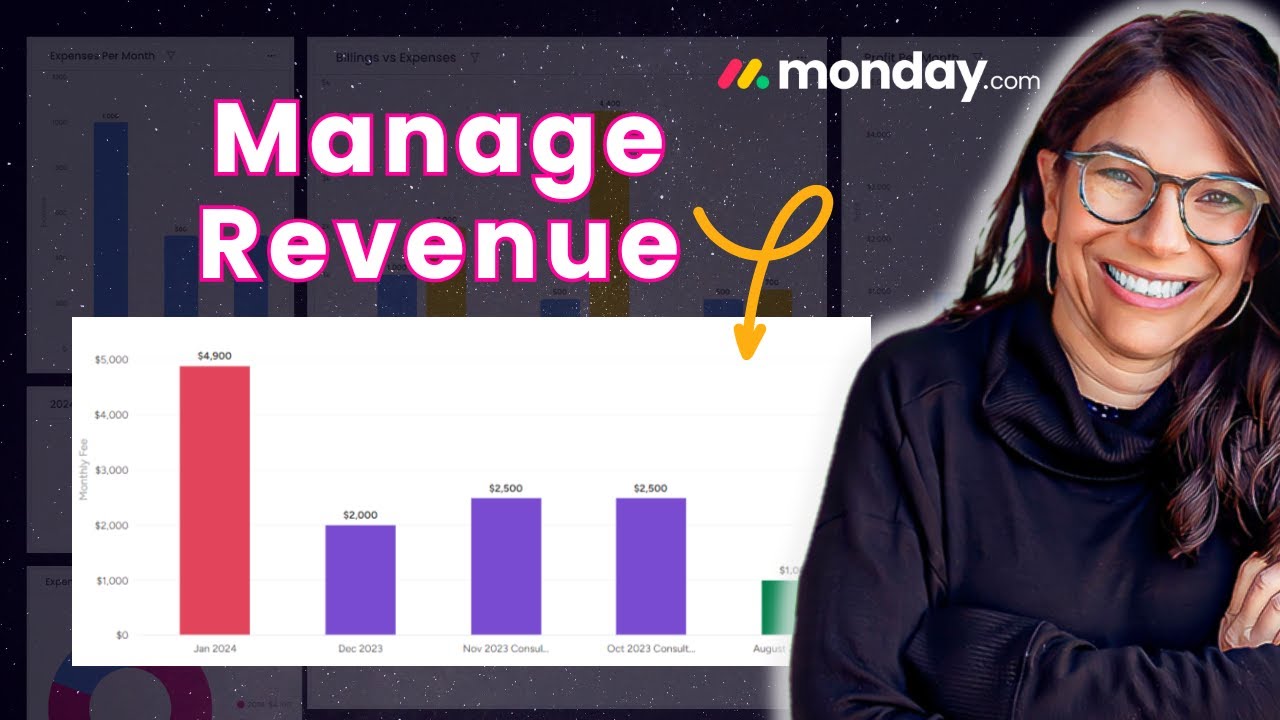
In today’s business world, keeping a close eye on your revenue is crucial. After all, your company’s financial health and growth trajectory depend on it. If you want an effective tool to track your revenue data, you can use monday.com. Many businesses struggle to get a real-time understanding of their revenue trends. Manually compiling spreadsheets and reports can be tedious and time-consuming. But with monday.com, you can set up an interactive dashboard that lets you see your revenue progress at a glance. I’ll walk you through how to leverage the chart widgets to simplify your revenue tracking and unlock powerful insights.
If you rather want to watch the whole process, check this YouTube video tutorial:
How to Set up a Revenue Tracking Board
To track your revenue month-over-month, you can use the chart widget feature. But first, you’ll need to set up your data in a way that makes it easy to visualize.
Organizing by Groups
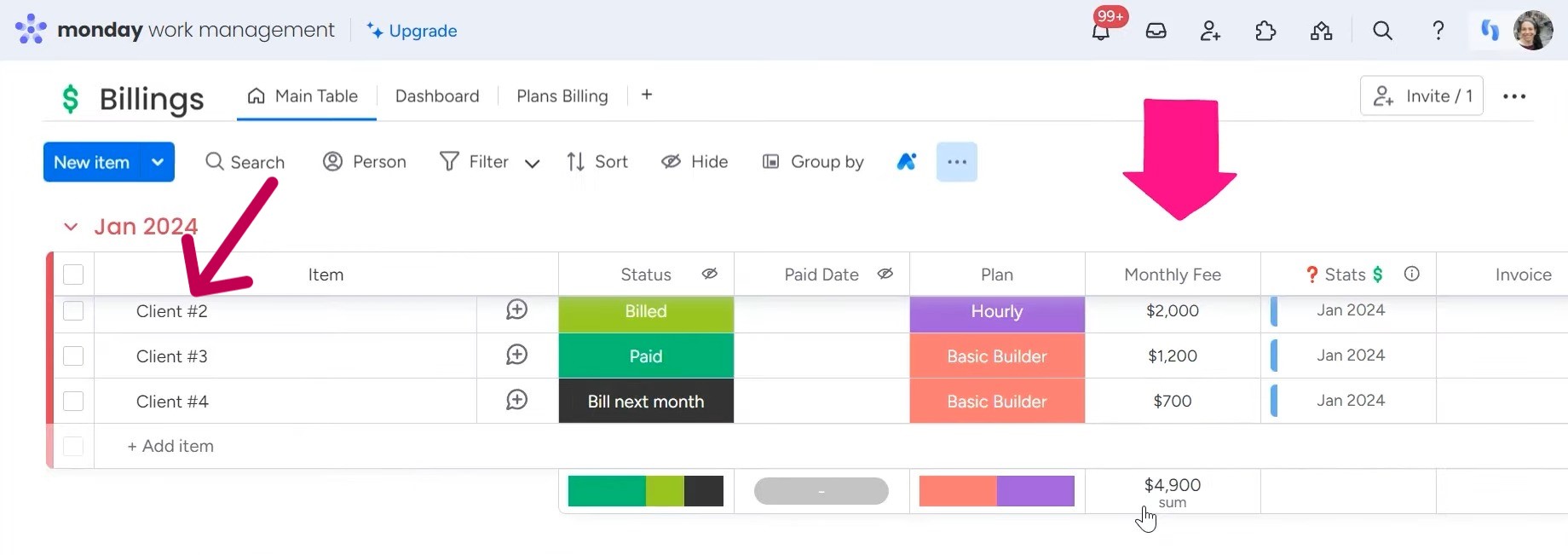
One straightforward approach is to organize your revenue information by groups, with each group representing a different month. So you might have a “January 2024” group, a “December 2023” group, and so on. Within each of these monthly groups, you’ll list out your clients and their corresponding monthly fees. This structure allows you to quickly see how your revenue is stacking up over time. Just scroll through the groups, and you can spot any trends or fluctuations in your monthly earnings.
Organizing by Dates
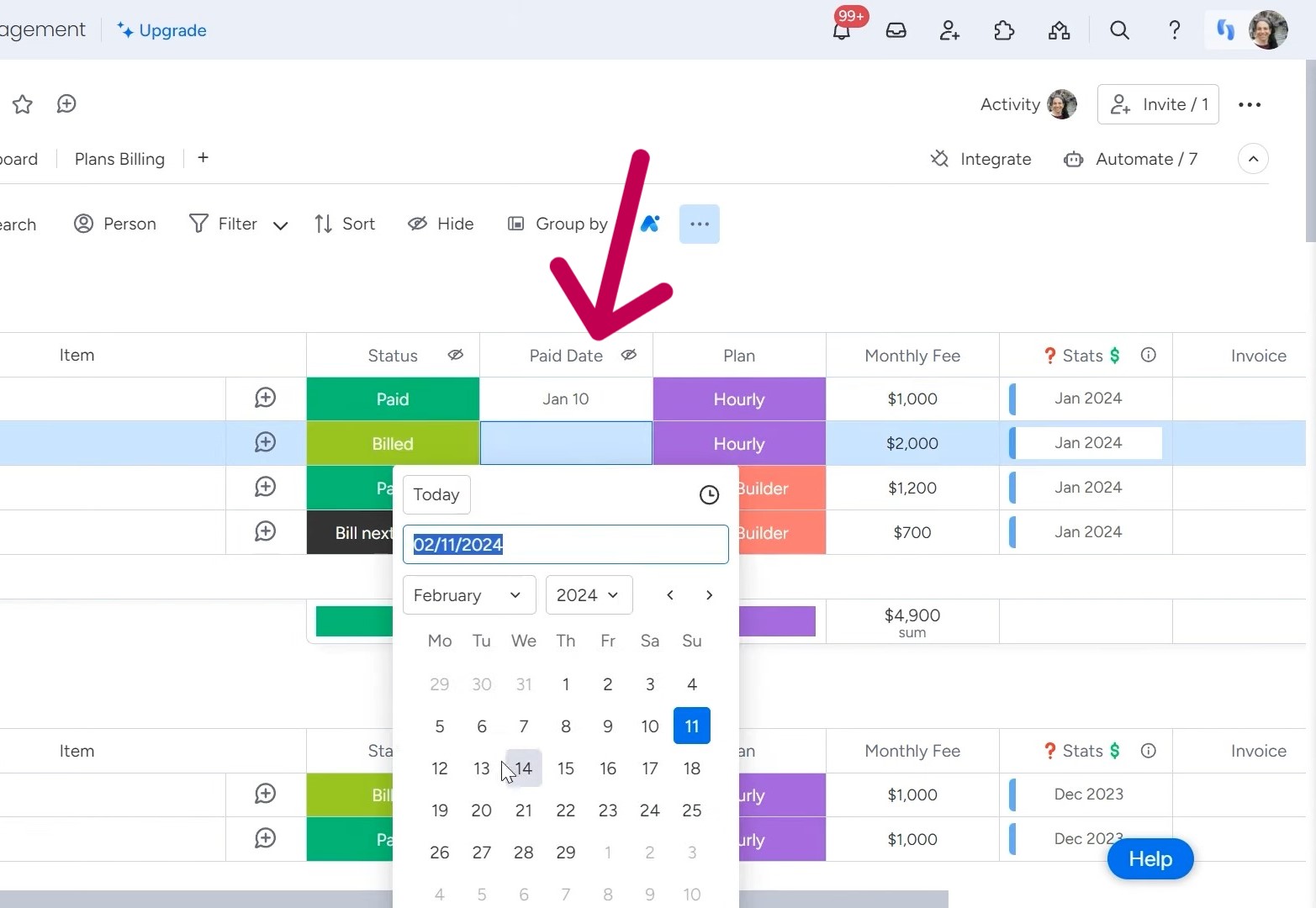
But what if you don’t want to divide everything by month? For example, maybe you want to group things by different types of paid projects or services instead. Or perhaps you’d prefer to simply track revenue by the specific date a payment was received. Not a problem! For example, you can set up your board to have a “Pay Date” column, where you’ll input the exact day a client made their payment. This gives you the flexibility to group and analyze your revenue data in different ways, like tracking individual client payments over time.
Creating a Revenue Tracking Dashboard
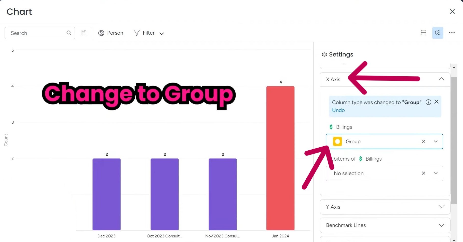
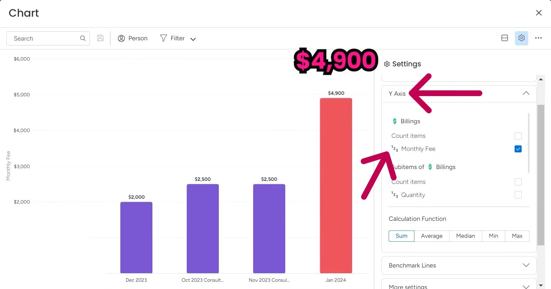
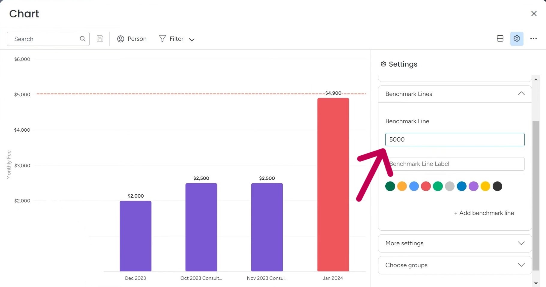
Since we’ve got our revenue tracking board set up, we’ll now use chart widgets here to visualize all the revenue information. Add a blank view to your board and then click that “Add Widget” button. From there, select the “Chart” option, and an empty chart will appear. Then, it’s time to configure your X-axis. In the chart settings, you’ll see an option to change the X-axis. Go ahead and select “Group” from the dropdown. This will allow you to list out all the different months, like January, November, and October, across the X-axis. For the Y-axis, you’ll want to focus on the “Monthly Fee” metric. This is where your actual revenue numbers will be displayed. By default, the chart might be set to count items in each group, but you can easily change that to show the sum of your monthly fees instead. If you’re shooting for a specific financial goal, say $5,000, you can easily track your progress with the benchmark line. Put your target amount, and you’ll be able to see how close you’re getting with each data point. And don’t worry, you can always adjust the goal if needed. Another cool feature is the ability to sort your data. You can choose ascending or descending order for the X- and Y-axis. And if you’re only interested in tracking a certain time period, like just 2024, you can easily select that by unchecking the other date ranges. As you add more months, you’ll be able to see your progress build up over time. The customization options are really what make this tool so powerful. You can tweak the colors, the display settings, and even choose whether to view cumulative data. It’s all about giving you the insights you need in a format that makes sense for your specific goals and preferences. If you want to view your data in a pie chart format, check this video. Sometimes, seeing the information laid out that way can give you some additional insights that you might have missed in the standard bar graph. If you are struggling with monday.com setup or customization, our experts at Simpleday are here to help. We can assist you in making data-driven decisions.