
The more you build inside monday.com, the harder it becomes to stay organized. You may start with a few boards. But before long, you have boards for every department, multiple automation chains, and integrations with tools like Zapier or Make.
It’s even more overwhelming when you’re managing projects across teams, such as sales, marketing, operations, and more. finding that “KPI for lead conversion” or “monthly ad spend” board starts to feel like a chore.
You can solve this problem by creating a Table of Contents board. It can organize and track everything inside your workspace. Let’s find out how you can create one in your monday account.
If you want to watch a tutorial on this topic, check this video:

How to Set up the Table of Contents Board
If your monday.com dashboard has several boards for marketing, sales, operations, and other purposes, it can be overwhelming. But you can keep this mess under control by creating a Table of Contents board.
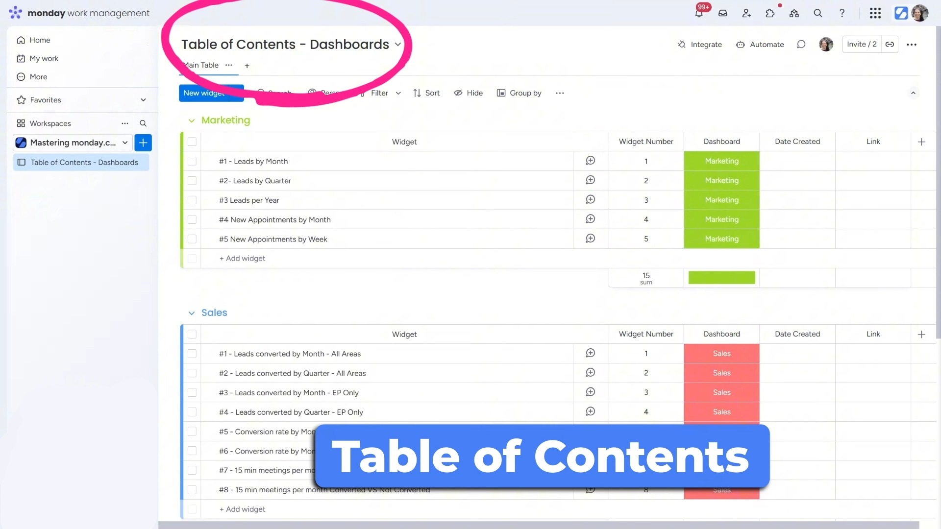
Instead of guessing or clicking through 10 dashboards, you can just open the TOC board, find what you need, and go straight there. Let’s see how you can do that:
1. Create a New Board
Start by creating a blank board, and give it a name, such as “Workspace Index” or “TOC Board.”
2. Add Groups by Category
Divide the board into groups based on your business needs. For example:
- Marketing
- Sales
- Operations
Each group will list all the widgets, automations, or integrations related to that area.
3. Use Columns to Stay Organized
Here’s the layout I recommend:
- Widget Number Column – Helps you keep everything in order.
- Name/Title Column – Write what the item is. (e.g., “Leads by Month”)
- Status Column – Show which dashboard or tool it belongs to. (e.g., “Marketing Dashboard”)
- Link Column – Paste a direct link to the dashboard, board, or integration.
- Date Created / Updated – Keep track of when it was added or changed.
Once it’s all set up, it becomes your master list for everything in monday.com.
4. Access the Information
If you go to the dashboards, you’ll see that it’s quite easy to access the information you need. We’ll start by looking at the Marketing Dashboard, which is organized for quick insights.
It has several widgets that have metrics to give you a clear overview of your lead generation trends at a glance. It’s better to name the widgets, such as “1# Leads by Month,” “2# Leads per Quarter,” etc., so you can find them at a glance.
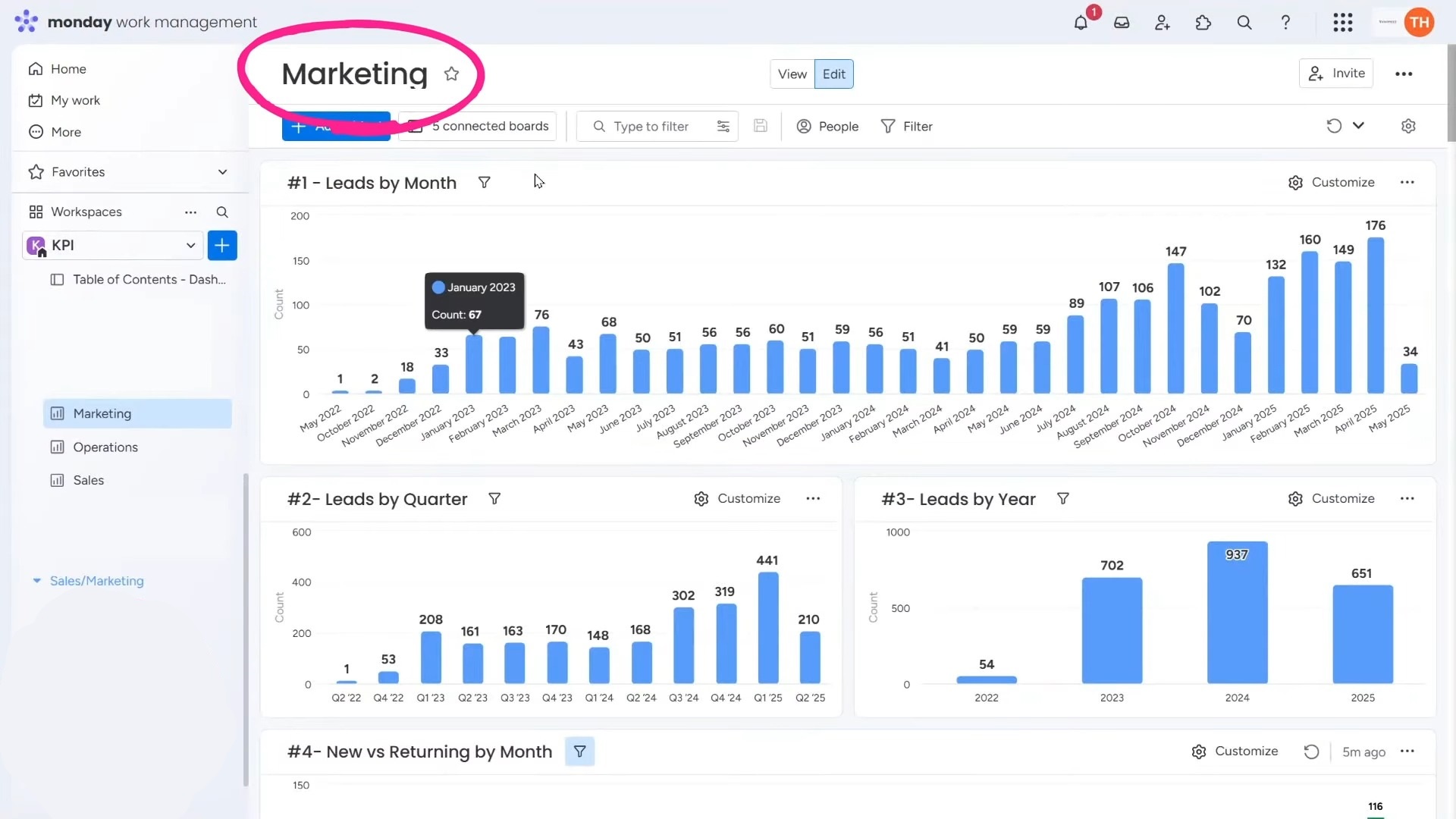
That way, when you’re looking for something specific, you don’t have to scroll endlessly. You can simply reference the Table of Contents board, which lists every widget across all dashboards.
Are you feeling overwhelmed by too many boards, dashboards, and automations in monday.com? At Simpleday, we specialize in turning chaos into clarity. We’ll help you build smart systems, so you and your team always know where everything lives. Book your free consultation!