
Tracking the key metrics for your website is crucial if you want to boost performance. Things like visitor numbers, conversion rate, and bounce rate tell you how your business is actually doing and what you should focus on next.
Luckily, setting up a useful dashboard on monday.com to monitor your website metrics is simple. All you have to do is add the right columns and charts to the main board. This makes the important data easy to see at a glance.
Follow these steps and you’ll be on your way to building a metric monitoring system that helps you achieve your business goals.
Creating a KPI Dashboard to Track Website Metrics
We will show you how to manually track key metrics and create a KPI dashboard in monday.com. You can also automate this process by connecting monday.com to analytics tools like Google Analytics.
Follow these quick steps to set up your custom metric tracker in monday.com:
Create a Board
The first step is setting up a basic board where you’ll track the website’s metrics.
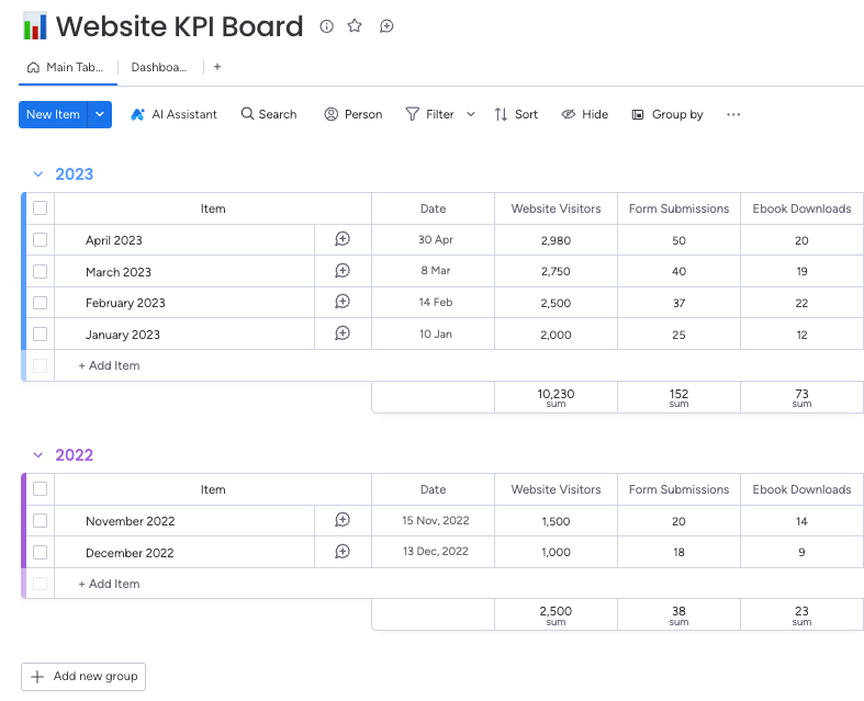
Then add number columns for the key metrics you want to monitor. Things like:
-
- Website visits
-
- Contact form submissions
-
- Newsletter signups
-
- eBook downloads
Create a Dashboard
After setting up the main board, the next step is creating a visual dashboard that displays your metrics in easy-to-read charts and graphs.
Click on the “+” sign beside the Main Table and choose the “Blank view” option. Then, change its name to “Dashboard” or something else.
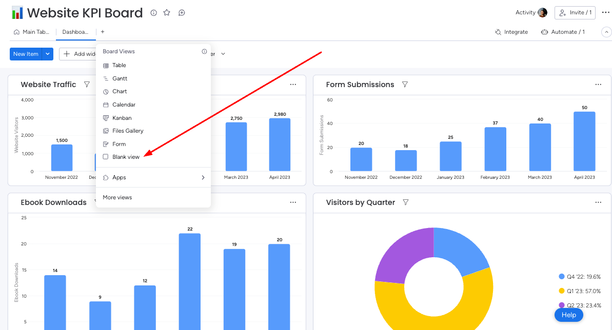
When you create the dashboard, add different widgets based on the metrics that matter most to your business. Click the “Add Widget” icon and choose the type you want: pie, line, column, etc.
Select the time period you want to show, such as day, month, quarter, year. Also, add the metrics you want to graph.
Repeat to add multiple widgets that show different metrics.
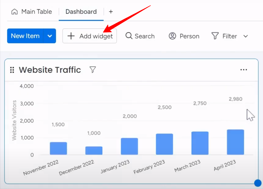
Keep adding widgets to visualize different metrics. Try out different types to see which work best. For example, a line chart may be perfect for showing how visitor numbers change over time. But a pie chart could help compare bounce rate vs conversion rate.
Once you set up a widget, you don’t have to configure it again. As you update the main board with fresh numbers, the dashboard will automatically refresh to show the latest data.
Conclusion
By following the simple steps I outlined, you can create a basic KPI dashboard setup and customize it over time. Review your dashboard weekly or monthly. It will reveal patterns and trouble spots, guiding how you optimize your website strategy.
Getting overwhelmed trying to set up your first monday.com dashboard? That’s no problem; our team of experts can help. We’d be happy to walk you through the whole process from the very beginning.