
Managing large projects and teams in monday.com can produce a lot of information. It’s not always easy sorting through everything on the boards. There’s a ton of numbers and details everywhere. But you can use pie charts to get a quick sense of how things break down visually.
Pie charts work great for things like status updates, team workloads, priorities, budgets – anything that needs to be divided up. They help teams get on the same page by presenting data in a simple graphic.
I’ll explain how to create pie charts with your data in this step-by-step tutorial.
How to Choose the Data for the Pie Chart
The first step of creating a pie chart is to identify the information you want to showcase. For example, you want to know the percentage of leads coming from different sources, like from Facebook, Google Ads, word-of-mouth, or other sources. Then, you have to select the column that contains the relevant data.
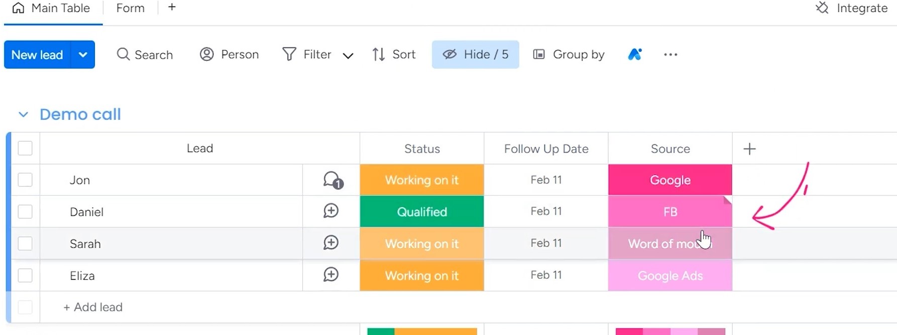
Finding the column is usually pretty straightforward. First, open up the board with your data table. Then scan the header rows to see the different field names.
Once you identify the column you want to use, just select it from the “Column” section when setting up the chart.
Creating the Pie Chart: All the Steps Explained
Let’s discuss all steps of creating a pie chart in detail.
If you want, you can follow my YouTube tutorial for a better understanding:

1. Setting Up the Dashboard
There are two main options for putting your pie chart: as a single chart or part of a full dashboard.
A single chart by itself works great for smaller boards. But for bigger projects, dashboards are better, so you can visualize multiple things side by side.
Here’s how to create a new view and add a chart widget for building a dashboard:
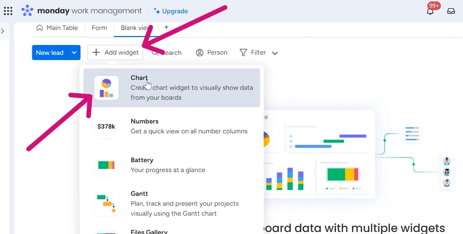
Go to your board and click the “Add View” or “+” button, and choose the “Blank View” from the dropdown menu.
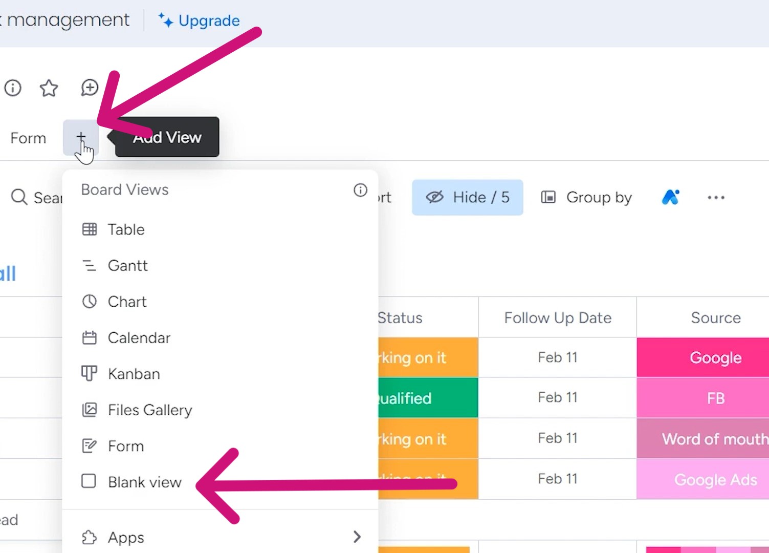
Click “Add Widget” and then select the “Chart” option. From there it’s easy to configure your pie chart with the data column you chose.
2. Editing the Chart
Once you’ve added the chart widget, you’ll want to edit it, so everything is organized the way you want. Click the three dots in the top right corner of your chart. This opens the settings menu.
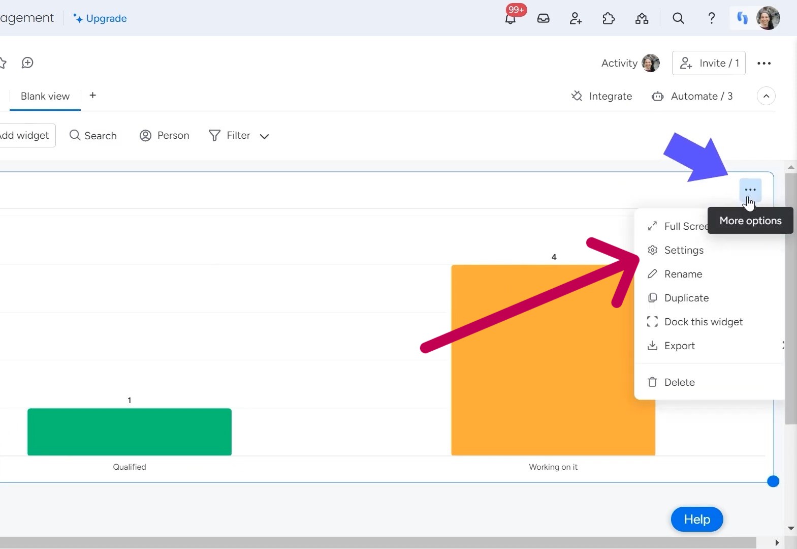
From here, you have full control over the look and functionality. First thing to do is change the actual chart type being used.
Under “Chart Type,” you’ll see a variety of options. Scroll through and find “Pie Chart.” Click on it to make the switch.
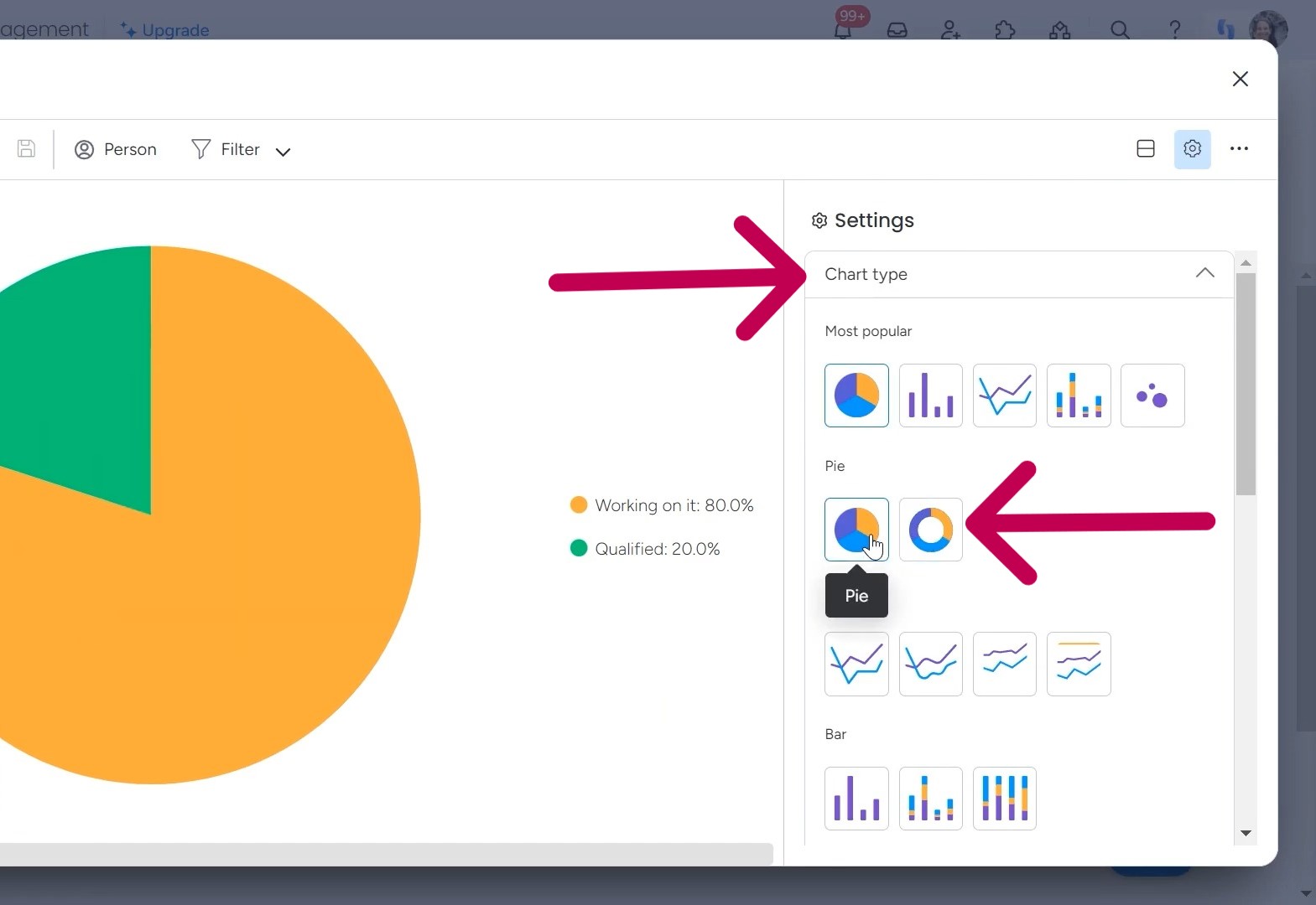
You can choose from two different pie chart styles. One has a donut shape and the other is a regular pie chart. Pick whichever one you find visually appealing.
3. Assigning Data
Now it’s time to connect your chart to the actual numbers you want to visualize. Under the “Labels” tab you’ll see the current “Column” listed. This shows where it’s pulling info from now.
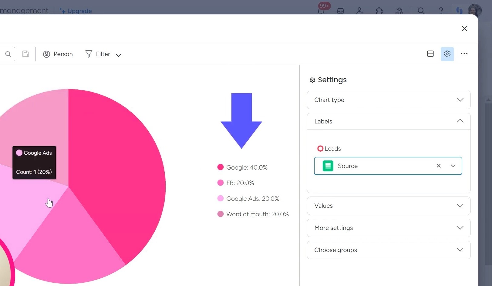
To select a different field, click the downward arrow next to “Column” and browse through options in the dropdown menu. Look for the one you identified earlier, like “Source” if showing lead sources.
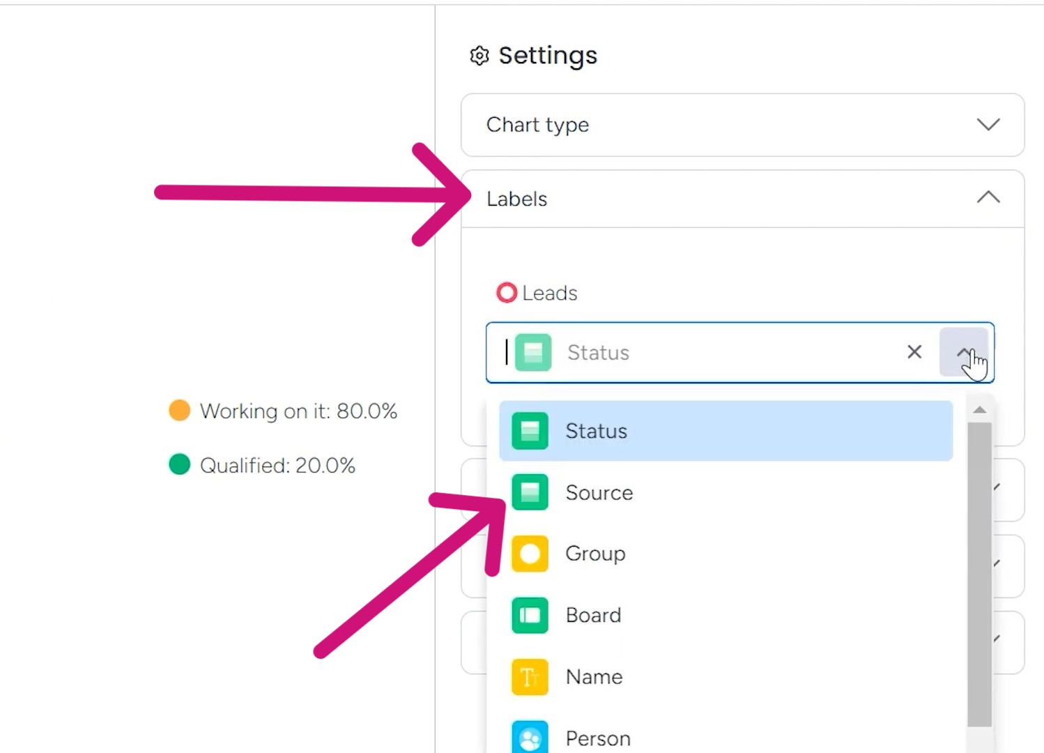
Click it to assign that column as the data populating your pie slices. monday.com will automatically structure the chart appropriately.
4. Customizing the Display
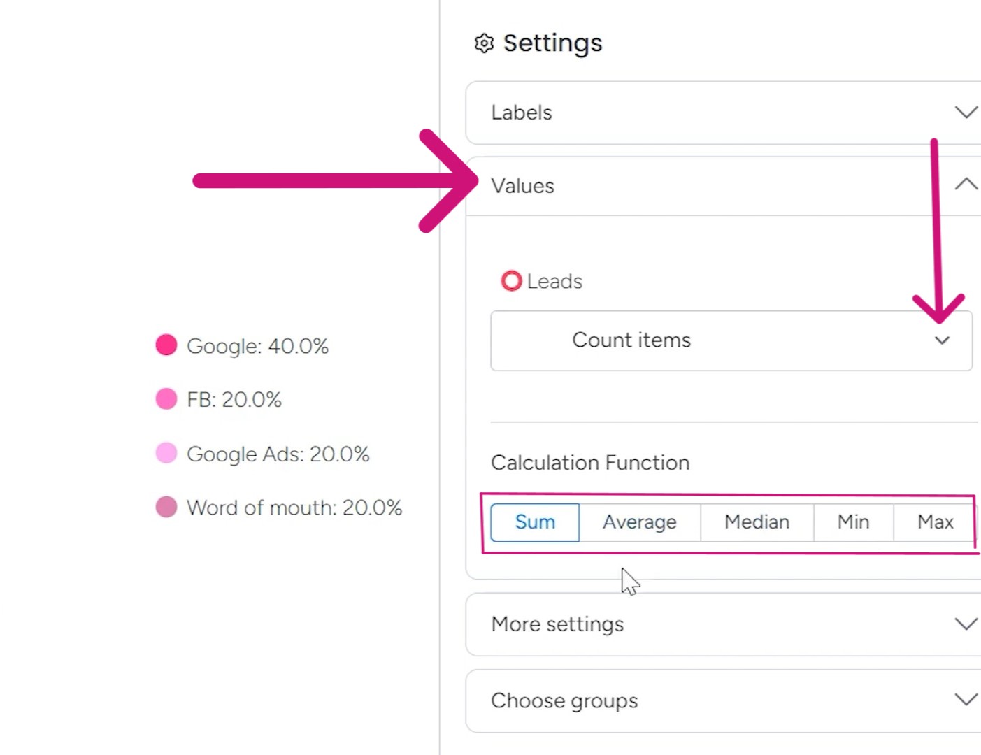
Once the data is assigned, you have options to show extra details in the chart. Under “Values”, you can choose to display the actual counts by total sum, average, or median.
And remember those leads I mentioned from Google and Facebook? From the “More settings” tab, you can view them as numerical values or percentage. There are also options to show the top or bottom line and empty values.
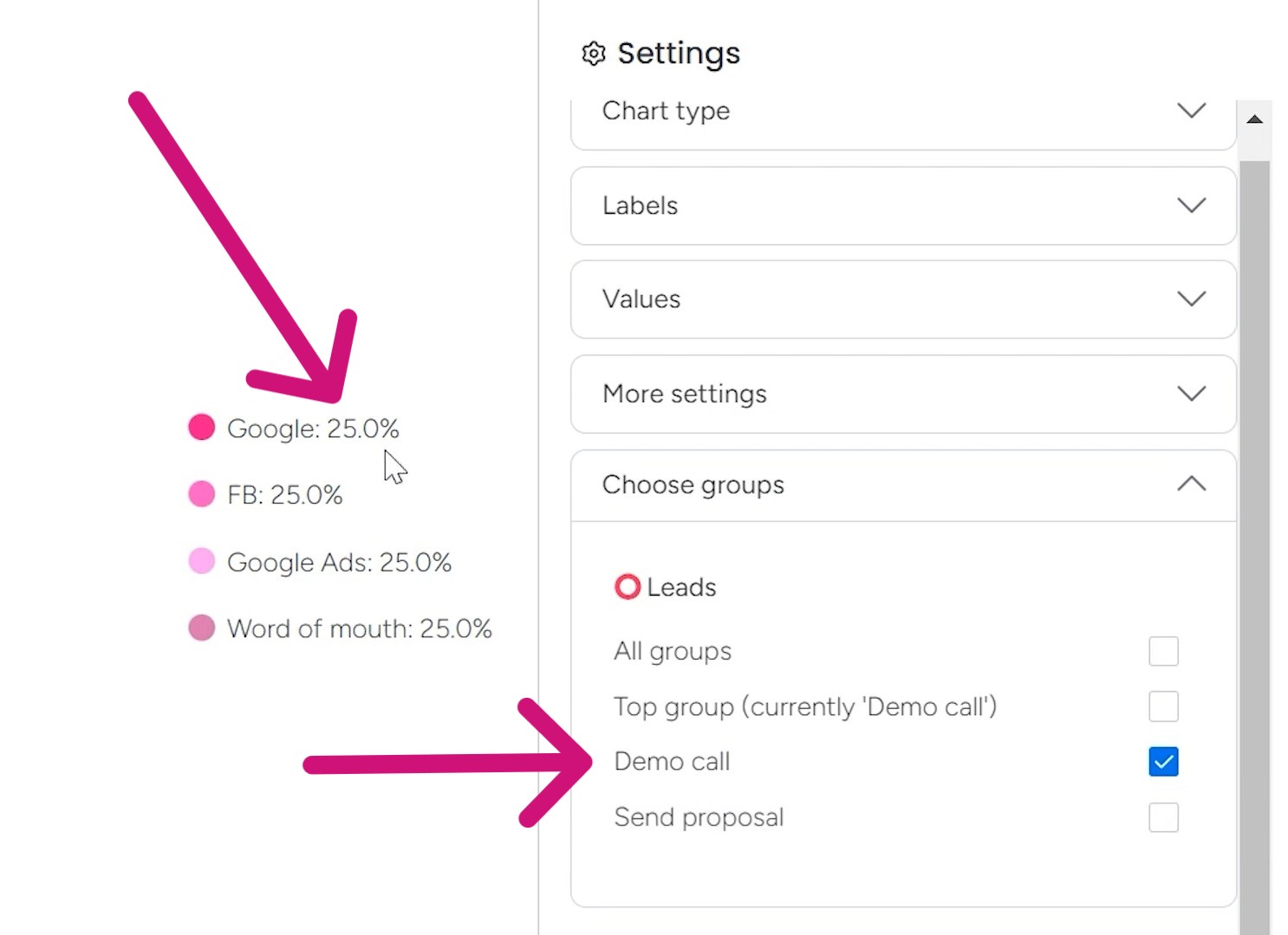
5. Selecting the Grouping
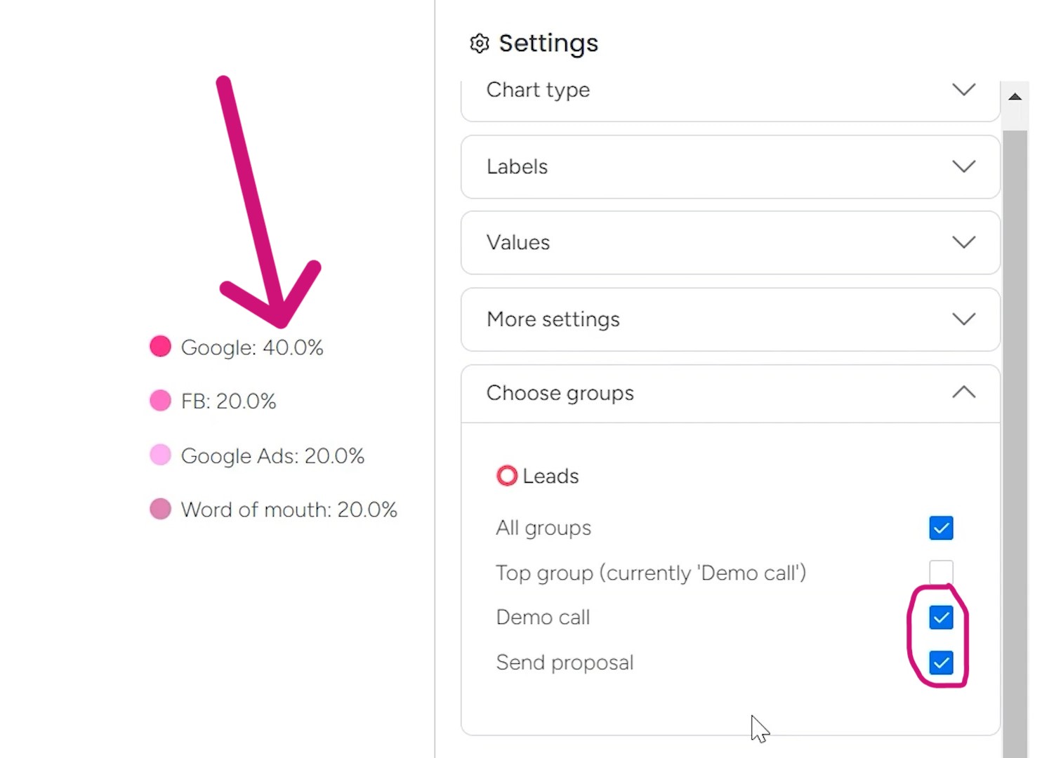
By using the “Choose groups” tab, you can create different groups to organize your data. For example, I’ve got one group for “Demo call” and another for “Send proposal.”
Now, let’s say you only want to track the source for upcoming demo calls. Just uncheck the proposal percentage group, and everything updates to show only the demo call data. It changes the percentages in the pie chart to 25% across the board.
When you click the “Send proposal” box too, the percentages change because now the pie chart displays all data on this board.
6. Filtering the Leads
If you want to view leads for just one specific person on your team, you can filter the data to show only their entries.
Or maybe you prefer to filter by column instead, like the lead status. For example, if I filter for just “qualified” leads, it looks like 100% of those are coming from Facebook right now.
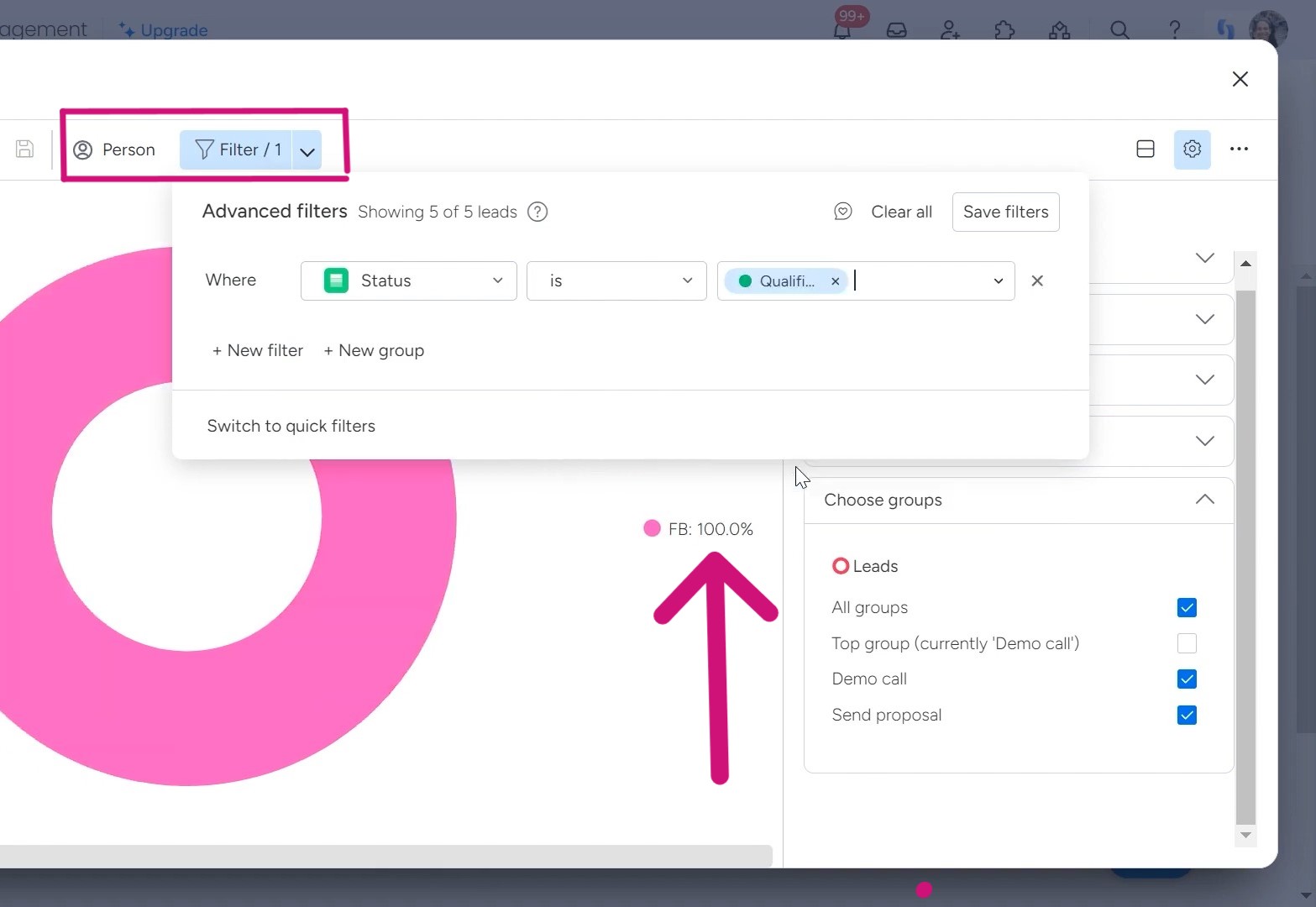
The filtering options are endless. You can view by status, salesperson, lead source, date, and so much more. It’s the perfect way to select exactly the data you need at any given moment.
Maybe you want to see the lead sources for each rep. Or perhaps you need a look at this month’s qualified opportunities. Just set your filters accordingly, and the customized view will be ready.
Are you struggling to understand how to leverage monday.com’s full capabilities in your workflows? Simpleday’s experts can help! We’ll guide you every step of the way until monday.com becomes your intuitive work platform.